

Selecting type for logos
The client describes their brand as: Bold, timeless, classic, delicate, approachable, modern, and sophisticated.
Tack on 10 more conflicting adjectives, and welcome to the world of designing brand identities :).
While some clients have a clear vision for their brand, many clients aren’t as specific.
And that’s okay! They’ve hired us as their designer to funnel their wide range of brand personalities into one solution.
But how can you begin this process when you’re staring at a blank page (er… artboard)?
It can feel daunting.
After asking last week what you’d like me to share when it comes to type, I had several responses similar to these I screenshotted below:


This ignited a fun idea/challenge for myself, which I’ll tackle into a 3-part series.
Here’s the challenge: Create custom logotypes for my family
Can I consolidate the many attributes of my husband into one logotype? What about my oldest son? Grandmother?
The answer is no. I cannot create a logo that encapsulates the depths of their personalities.
But that’s the point ;).
The same is true when designing for businesses. There are many facets that make each brand unique that in no way could translate into one logo.
If you try to include too many brand attributes into a logo you’ll not only dilute the visual messaging, but you’ll complicate the overall mark. This can hinder legibility and overall aesthetics.
While there are ways to create a logotype that conveys different brand attributes, there’s no way you can encapsulate them all. A full brand identity beyond the logotype is necessary to carry the different brand emotions. Photography, illustration, color, and messaging add layers beyond the logo to create a comprehensive brand.
Back to my personal challenge…
Let’s dig in as I design 3 logotypes for my family. I’ll share a bit about their personalities, and why I selected the type, and next week I’ll share how I manipulated the type in Illustrator.
Let’s go!
Frances
My late grandmother, Mary Frances, was sophisticated, timeless, and beautiful. For this challenge I will use “Frances” because 1) I adore that part of her name and 2) I wanted a short name to really highlight the letterforms for this challenge.
Mary Frances wore pearls, flawless makeup, hair, and fashion.
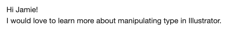
If I stopped at these adjectives when designing her logotype, I might consider a light romantic serif such as Ogg. Possibly a go-to san like Sweet Sans set in small caps tracked out significantly.
But let’s add another layer to her personality.
Mary Frances was strong. She endured a lot in her life and was resilient. Confident. Steady. She was a strong support for her kids in the midst of challenging circumstances.
If I only focused on the latter brand words, I envision something more solid than Ogg. Visually this would translate to selecting a bold font. I also envision something with more complexity than Sweet Sans. Sweet Sans feels too straightforward for the contrasting “sophisticated, beautiful, yet resident and confident” adjectives.
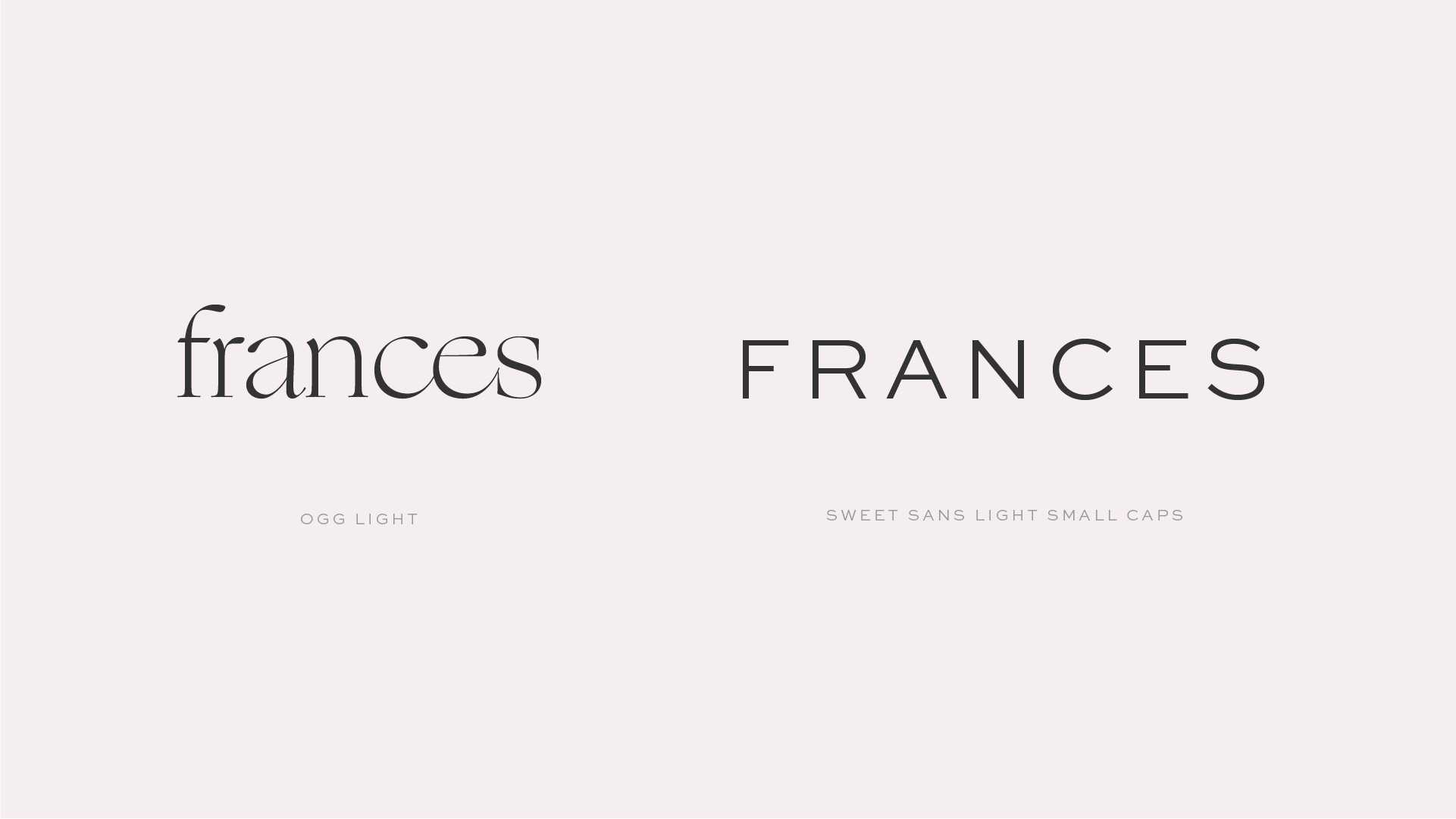
What I landed on was Bourbon St by Andrei Robu. This typeface feels very distinctive — something that Sweet Sans was missing. Mary Frances was unique and deserves type that reflects that. The letterforms carry sturdy weight through their bold strokes. The type is also semi condensed which feels confident — standing strong and tall. Bourbon St also has beautiful ligatures and alternates. Many of which bring in the soft, sophisticated, and elegant side of my grandmother. The beautiful swashes and ligatures have curves to contrast the otherwise harsh, bold qualities of the type.
I chose to set the type in lowercase to add in a layer of approachability. Though Mary Frances was strong, she wasn’t overly bold. There was a softness to her. The uppercase letters in Bourbon St felt too harsh, while the lowercase letterforms felt more like her.
I customized the final “frances” mark through a ligature combining the “r” and “a” letterforms. The concept behind these letterforms is the solid support my grandmother provided. Almost as if the “r” is shouldering the weight of the “a.”
The final logotype focuses on a few distinctive characteristics of Mary Frances, yet will never encapsulate her full personality. The final result still feels like her, especially when digging in deeper into the concept behind the type.
Elliot
My husband! It’s true — I designed his logotype in 15 minutes. Whoops. We’ve been married 12 years, together for 17, and I’ve known him for 20 years… I feel somewhat guilty about the speedy logotype during this challenge.
BUT, this is all for fun.
Here are the quick facts about Elliot: He’s a bit quirky. This is his most distinctive quality that I want to translate visually somewhere in the logo. He’s fun, lighthearted, out of the box, warm, friendly, and approachable. He’s tall and skinny (a runner). Elliot is grounded, level-headed, confident, and never embarrassed. He’s the guy on the dance floors at weddings that you wonder how much he had to drink… only to find out he doesn’t drink at all. He’s just that unashamed and fun-loving :). And yet, he’s got a serious and compassionate side.
As I approached selecting the typeface for Elliot I wanted to highlight the quirk in his personality while also grounding it with his compassion and strength. Visually, this meant selecting type that didn’t feel too fun or playful. While this would feel like Elliot in some situations, it could lose the solid foundation he is in our family.
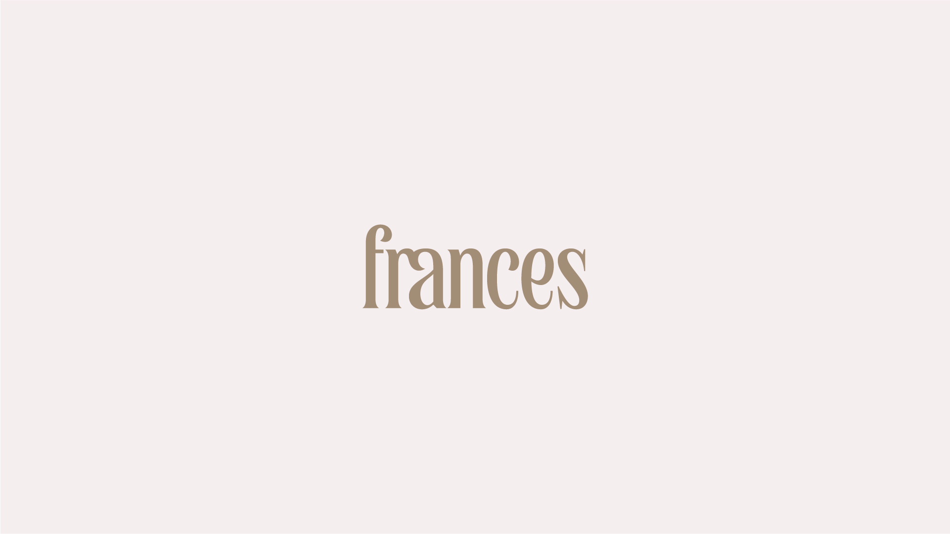
Physically he’s noticeably tall and lean. I translated this most literally to an uppercase condensed sans, which feels tall and lean itself.
For the final logotype I selected Rough Cut by Simon Walker. Rough Cut is a gothic-style font with an approachable edge. The slight serifs almost felt wiggly to me, adding a slight quirk to the font. Overall, the font doesn’t feel like it’s taking itself too seriously. It’s highly legible and easy to read, which could translate as how Elliot is so widely loved by everyone he crosses paths with. Elliot doesn’t need a complex font — he’s an easy-going, loveable guy. Rough Cut stands tall, especially in all caps, yet doesn’t feel overpowering through the slight curves and open counters (negative space enclosed in letterforms like “o”).
I customized the logotype by manipulating the letterform “E.” This makes the entire logotype feel more unique and considered, more outside of the box than simply typing the font without customization. I drew a wavy bar to customize the type, which adds another layer of approachability and fun. It also made the logotype feel approachable through the curve, rather than a straight line would.
Hank
My oldest son, Hank, at 6 years old has quite the personality. He’s fun, fervent, playful, and a character. “He’s a crack-up” is how one of his teachers described him. Though he’s full of joy, he also has a tenacious and strong-willed side to him.
We chose the name Hank for several reasons including a song by Ben Rector. One of the adjectives we associated with the name Hank was “strong.” And I think that suits him well. He’s firm in his beliefs, has a strong sense of justice and his love is mighty :). The name Hank also feels a bit southern to us. We’re from Texas, and though we no longer live there, his name feels a bit like home.
There are many other attributes of Hank including his deeply compassionate nature, his unmatched energy, and his loyalty. For his logotype, I chose to focus on his dominant traits that if you meet Hank, you’ll uncover in a few minutes. Fun & fervent.
Visually, I translated his personality into an extra bold typeface. I wanted something that felt really grounded. Bold in both stature and thickness. He is tall and skinny like Elliot, so I considered a bold condensed typeface. However, a condensed typeface wouldn’t take up as much space horizontally as I’d imagined. I wanted a typeface that had a bold presence. With only 4 letters in his name, a wider font was better suited.
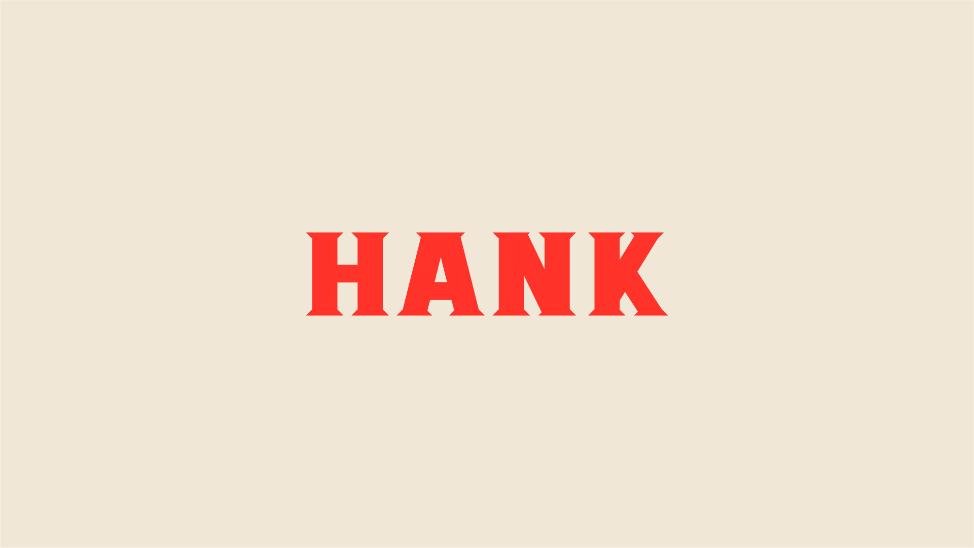
I landed on Folsom Regular by Jen Wagner. Folsom is a strong sans-serif font inspired by Johnny Cash posters. Isn’t that perfect? A strong font based on a southern country singer. I’ll admit, I didn’t know Folsom was inspired by Cash until I looked it up later. It was meant to be :).
To customize the type for the logo, I added a bold, playful, and angular serif. This adds to the fun side of Hank, while also creating a distinctive logotype. The serifs feel a bit southern as well, giving an homage to his name.
—–
What a fun challenge to (quickly) design 3 logotypes based on family members. I loved this challenge because it really helped me practice my editing process. Consolidating a wide range of personality traits and quirks into one impactful customized logotype.
Sometimes I get hung up when designing brands for clients in trying to include everything into one logotype. Convey every intricacy and differentiator into their logotype. It’s just not feasible. It’s a great exercise to see what you can remove, simplify and edit to create a more impactful and distinctive mark.

Ashley Ringaman
Always love hearing from you and seeing your perspective laid out!
jamie
Post authorThanks, Ashley! 💛
Hayley Heatley
Your logo fonts matched the descriptions perfectly. It was insightful to walk through your process. I am eager to read Part II.
jamie
Post authorThank you, Haley! Part 2 is up on YouTube! https://youtu.be/rnA4VFucNb8
Yari
Oooh what a fun exercise! Love seeing your process to adding layers to your type choices.
jamie
Post authorThank you, Yari! Of course you’re interested in the strategy side of things — love that! 💛
Olivia
This was so fun to read! 😍
jamie
Post authorSo glad you enjoyed it, Olivia!